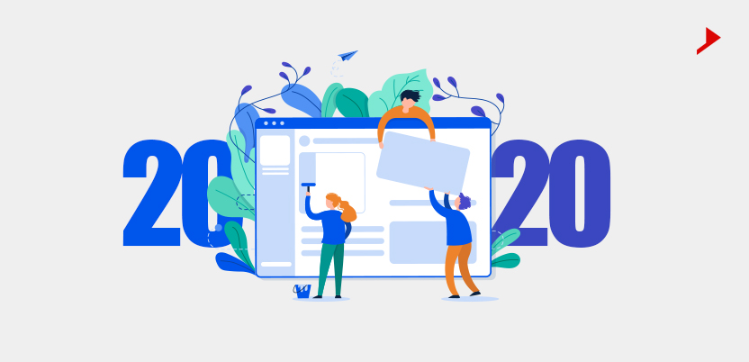
As 2020 is going to be a different year for Website Designing Trends, to everyone’s mind. A year when all of us are going to focus a little less on this layout, that color scheme, and whichever nifty animation mode caught our eye last week, and instead consider the deeper underlying concerns of design.
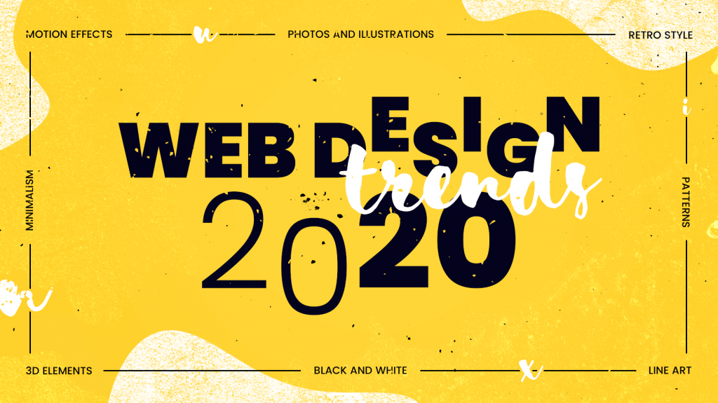
So here we are ditching the same ole design specifics we see year after year (broken grids, anyone?!) to focus on the bigger picture. To ask far more significant questions like:
– How do we design to make information clear, while still making it easily consumable?
– How do we make design universal, ensuring that no one feels excluded or erased by our decisions?
– And, perhaps most significantly, how will a new generation of tools, built upon a paradigm that’s simultaneously brand-new, yet old as spreadsheets, change not only the way we work, but also what we produce?
But more on that last point later. Let’s dive into the 5 web design trends we’ll see in 2020:
1 Dark Mode: Dark mode web designs not only look ultra-modern, but they’re easy on the eyes and make colors and design elements pop.
Sometimes the most visually stunning web design trends have practical beginnings. Dark themes are better for OLED screens—saving power and extending screen lifespans—but that utility doesn’t stop them from looking good. Dark backgrounds improve the visibility of other accent colors for truly dynamic design.
Coincidentally, the dark mode design aesthetic also fits in perfectly with other prevalent 2020 design trends that include dark and moody color schemes combined with glowing neons as well as futuristic yet dark cyberpunk and dystopian styles.
2. 3D Elements: 3D visuals have always delighted people; what held this trend back was technology and the (previously) expensive price tag. But as Pinch Studio explains, the technology is now in a place where you can design in 3D without NASA-tier equipment, opening the gates to more and more designers.
Until VR becomes more mainstream and cost-effective, hyper-realistic 3D that’s often taking up the whole screen is the best way to create an immersive experience for your site. That’s not just an advantage for visuals, but for UX as well—interactive 3D design encourages users to stay longer. As 2020 unfolds, expect to see more immersive 3D web designs drawing users in and visually breaking down the boundaries between digital space and reality.
3. Layering the designs: This trend is all about creating depth. Like the 3D effect from above but want to tone it down? Soft shadows and floating elements add interest and depth and give your web page a “3D Lite” look. It’s not just graphics either: you can use this effect with text and photos, too.
Taking the principles of material design a step further, designers can add a little extra pizzazz to 2D layouts with soft drop shadows and layering elements on top of each other for extended depth. These effects give the design a lightweight feel, as if the elements are floating over each other—a sharp contrast from classic, impenetrable flat Website Designing Trends where the layers seem, well, flat.
4. Advanced Navigation System: With the rise of wearable devices like smartwatches, web design in general is thinking smaller. The area most affected by this is navigation, the glue that holds a website together. Over the last few years, navigation has been getting simpler and simpler to accommodate extremely small devices and even smaller attention spans.
Extremely minimalist navigation takes away much of the difficulty in usability. The less a user has to think about moving around, the more time they spend immersed in the site, actually moving around instead of wondering how.
At the same time, imagery is becoming more important. Large-scale photos and videos are your chance to impress users—while only using the bare minimum of text.
5. Adding images with graphics: Overlapping original graphics on top of real photographs creates a memorable visual, which lends itself to letting your creativity go wild.
This collage-like trend is a versatile one; you can use it to add a special cuteness and charm to otherwise bland product photo (TSP stoneware, above), or you can use its more serious attributes to better communicate complicated or abstract concepts like tech or finance. It’s a way to customize your imagery and add more personality (a reoccurring trend in 2020) to your web design.
To make the most of this trend’s flexibility, be sure to match the style of the illustrations and graphics with your brand personality. Their style can sway how people interpret the photograph—cartoon squiggles for something more playful, or geometric and detailed illustrations for something more sophisticated.
Looking forward for more Website Designing Trends in 2020. Don’t worry Rama Web Solutions got your back. Being one of the best website designing company in Delhi, the experts here will help you with all the designing problems. Visit https://www.ramawebsolutions.com/ for more information.

